Prismui
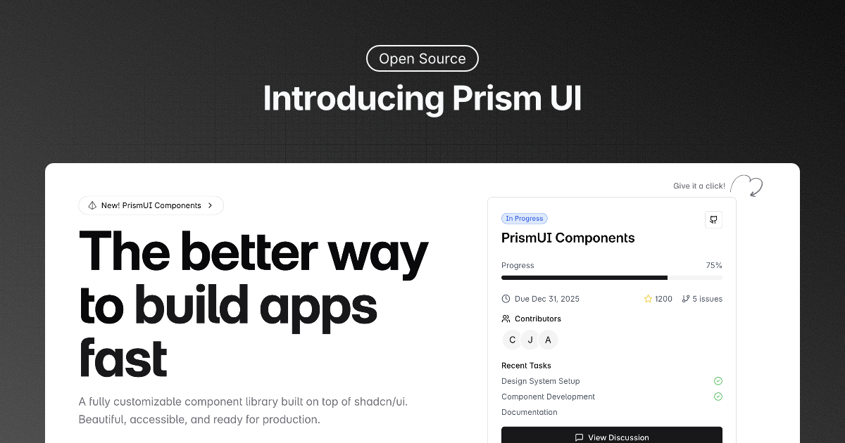
Prism UI: Beautiful Components Built on shadcn/ui
A modern, accessible component library built on top of shadcn/ui, combining the power of Radix UI primitives with the flexibility of Tailwind CSS.

Introduction · Installation · Tech Stack + Features · Credits
Introduction
Welcome to Prism UI – a modern, accessible, and beautiful React component library built on top of shadcn/ui. We extend and enhance the already powerful shadcn/ui components with additional features, pre-built sections, and complex UI patterns that help developers create stunning web applications faster than ever.
Our library provides everything you need to build modern web applications:
- Pre-built page sections (Hero, Features, Headers)
- Complex UI patterns and layouts
- Full TypeScript support
- Style and customize everything to match your brand
What we are using
Built on a strong foundation:
- shadcn/ui's rock-solid components
- Next.js 14 with React Server Components
- Radix UI primitives for accessibility
- Tailwind CSS for styling
- TypeScript for type safety
All seamlessly integrated to provide the best developer experience.
Directory Structure
Prism UI follows a clear and organized structure:
.
├── src                         # Main project directory
│    ├── components             # UI components
│    │    ├── blog              # MDX components for blog
│    │    ├── docs              # MDX components for documentation
│    │    ├── prismui           # Prism UI custom components
│    │    ├── sections          # Pre-built page sections
│    │    └── ui                # Base shadcn/ui components
│    ├── content                # Documentation and blog content
│    └── lib                    # Utilities and helpers
├── LICENSE
└── README.md
Installation
Get started with Prism UI in your project:
# Create a new Next.js project
npx create-next-app@latest my-app --typescript --tailwind --app

# Install shadcn/ui
npx shadcn@latest init

# Add base components
npx shadcn@latest add button
Tech Stack + Features
Core Foundation
- shadcn/ui – Our foundation for reliable, accessible components
- Next.js – React framework for building performant apps
- Radix UI – Accessible UI component primitives
- Tailwind CSS – Utility-first CSS framework
Pre-built Sections
- Hero Sections – Multiple layouts for landing pages
- Feature Grids – Showcase your product features
- Headers & Navigation – Responsive navigation systems
- Main Features – Highlight key features with style
- Footers – Various footer layouts
Developer Experience
- Full TypeScript support
- Ready-to-use page templates
- Dark mode support
- Responsive design
- Accessibility features
Development
- TypeScript – Static type checking
- MDX – Documentation and blog posts
- ESLint – Code linting
- Prettier – Code formatting
Contributing
We love our contributors! Here's how you can contribute:
- Open an issue if you believe you've encountered a bug
- Make a pull request to add new features/make quality-of-life improvements/fix bugs
Getting Started with Issues
- 🔍 Find an issue you want to work on in our issues page
- 💬 Comment
.takeon the issue you want to work on - 🎉 The issue will be automatically assigned to you
The .take command helps us track who's working on what. Once you comment .take, our bot will:
- Assign the issue to you
- Add an "in progress" label
- Let others know the issue is being worked on
Contributors
Repo Activity

